
We’ve recently faced a difficult meeting with academics. Earlier in the year, we had a technical problem (a big reliability one) and now our academics are understandably far more critical of all aspects of the Dashboard. There were a number of overarching themes:
- There were too many different data points each requiring a decision
- There wasn’t the data that they wanted
- There was scepticism about the data presented
- No-one had read the user guide/ clicked on the help links
We were particularly challenged about usability. I tend to think that the resource is very easy to understand, but what I think is unimportant. I’ve spent years worrying about the specifics of the tool. I’m far too close to it to have an objective perspective on how easy it is to understand.
Case Study: data must be easily comparable
I’d like to take one criticism in some detail.
One common concern is that tutors place enormous value on the validity of attendance compared to other data sources (library use, VLE log ins etc.). Attendance is the perceived gold standard. Understandably so, it’s the bit that staff can see and there are numerous studies to support the case for attendance being a strong predictor of success.
We added a view of attendance into the tool in 2016 and embedded attendance into the algorithm in 2017. I don’t think we thought enough about what we were presenting though and this has led to confusion.
In that context one academic challenged us about a perceived inconsistency between attendance and engagement. “I have several students with really good attendance, but only ‘partial’ engagement. That can’t be right.” We were given some examples of students and I’m going to take one here.
Student A has 92% attendance. That’s 92% average attendance so far this year (September to March). My understanding of attendance research is that it tends to peak early in the first term and then gradually falls away. I think this is for two reasons:
- Firstly, students strategically prioritise coursework submission over attending classes
- Secondly, non-attendance becomes normalised. First a few people don’t turn up, then a few more until classes at the end of the year can be quite empty.
In practice then, it’s highly likely that overall average attendance is always going to look a little bit better than attendance for any given week (particularly later in the year).
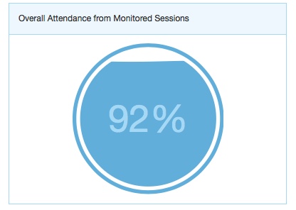
At the time of the meeting, whilst Student A’s attendance was 92%, their engagement was ‘partial’ (1). The Dashboard algorithm is based on both how much a student has engaged with resources on the previous day (VLE, online submission, card swipes, attendance etc.) and also looks back and compares that day’s engagement with the preceding week. This is done to prevent insanely spiky graphs and make it easier for staff and students to understand the ‘big picture’.
The ‘class list’ view therefore shows both a student’s average attendance this year alongside their current engagement rating. In this instance 92% attendance and Partial engagement.
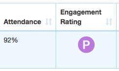
At first they look contradictory. How can an excellent attender have only middling engagement?
The answer is of course, that we’re not comparing the same thing.
Yes Student A’s attendance is excellent (2).
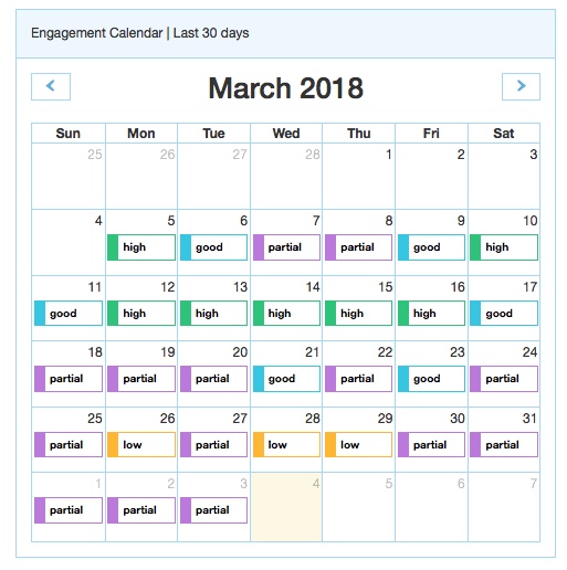
If you look in the screen shot below, it’s clear that this is a highly engaged student. If our difficult meeting had been in the second week of March, the student’s average engagement would have been ‘high’ and probably ‘good’ well into the third week. However, our meeting took place in the final week of March and the students’ engagement was partial. The important piece of the puzzle though is that Student A had lots of deadlines in mid-March. They had quite understandably started to ease off in the last week or so before Easter.
However, because we are comparing two completely different time periods, we are making it hard for the user to meaningfully interpret the relationship between attendance and engagement.
Lessons
- Comparing average attendance for the year against average engagement for the last week is unnecessarily difficult and confusing. Any snapshot should always be for a comparable time period, otherwise an end user has to hold two very different pieces of information in their head at the same time.
- If a user has to think twice about data, it’s too confusing. The design has failed.
- If we are asking anyone to interpret more than one significant data point, it must be for the same time period.
(1) Typically at any given time, there are more students with partial engagement than any of the other four categories (‘high’, ‘low’ etc). Around 80% of first year students with partial average engagement complete the year, but noticeably fewer achieve grades above 60% compared to those with ‘good’ or ‘high’ average engagement. Partial used to be known as ‘satisfactory’ but academics wanted a word that meant ‘in the middle, but don’t take that as a signal that you can relax’.
(2) However, even here we’ve found a problem. When we dug down into our attendance system, the last recorded attendance for the student was late in February. The student’s average attendance between September and February was 92%, we don’t know what it was September – March (we are investigating though).
